Home Tour: Brooklyn Blues Inspire this Mosman Property
A Victorian-style home in Mosman gets an edgy update, blending Brooklyn vibes with whimsy pops of colour, texture and playfulness.

Who says grown-ups can’t breathe some fun and playfulness into their homes? Walking through this double-fronted Victorian-style property in the leafy Sydney suburb of Mosman is a refreshing reminder that our spaces can embrace a sense of whimsy, wonder and a vibrant array of colour.
It was an out-of-the-box concept that interior design studio, Tom Mark Henry, was more than happy to help deliver for the young family of four.
The family sought to breathe new life into their home with a bright and bold refresh and they were in good hands with the award-winning interior design studio.

International Influences
“The clients referenced a love of Brooklyn brownstones and London townhouses and were not afraid of quirky style or colour — they wanted an injection of colour and personality,” Tom Mark Henry’s Interior Designer Jed Murphy explains of the four-bedroom house’s exciting update.
While the family wanted to create their own unique flair, it was also important the revamp respected the heritage roots of the home.
Therefore, the Tom Mark Henry team retained the formal living and dining rooms on the street side of the house, which are used as adult spaces for entertaining and relaxing, while updating the informal open-plan kitchen and family room, adding a dining nook, which is perfect for family mealtimes and playtime.
Feeling Blue
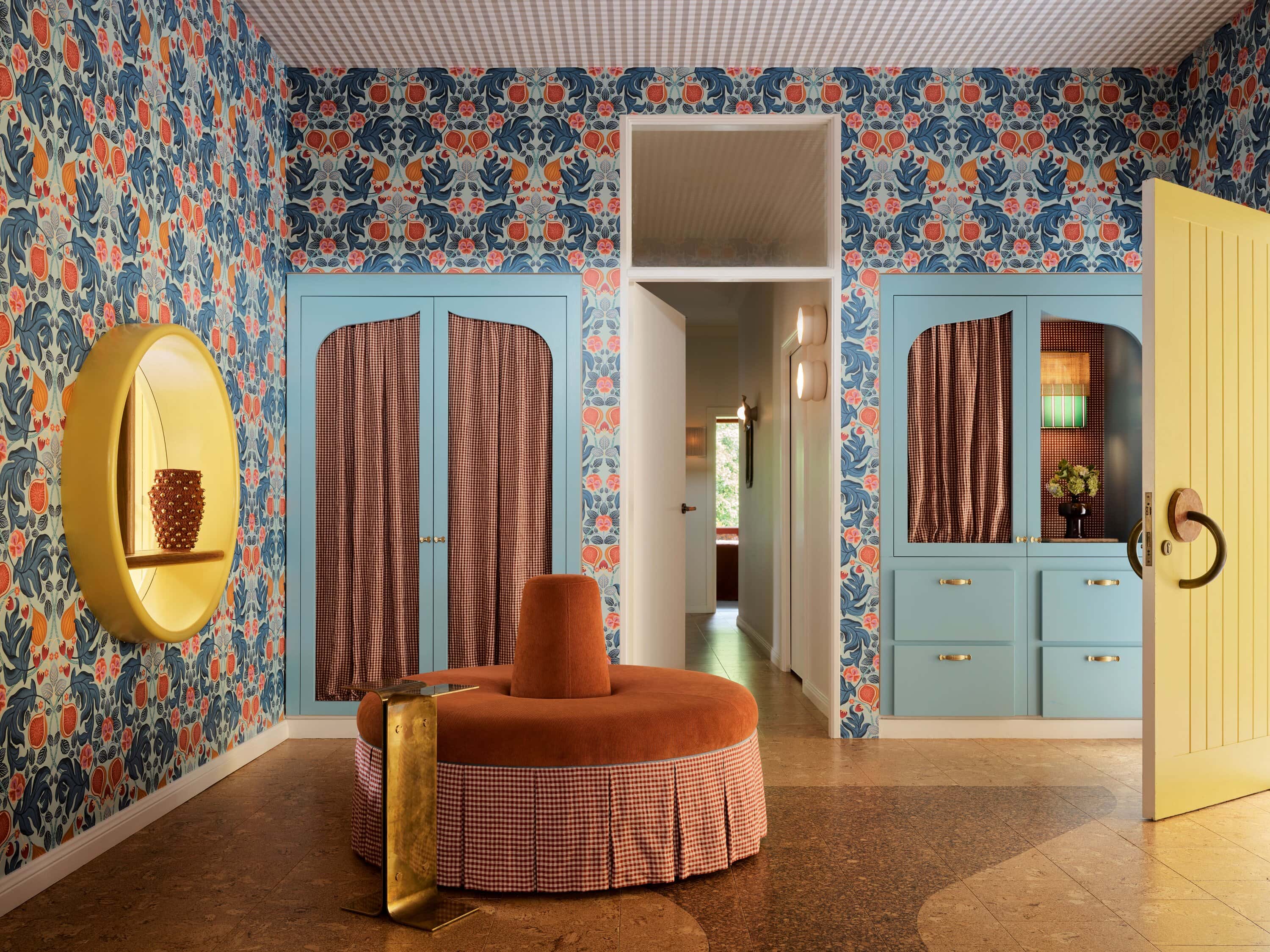
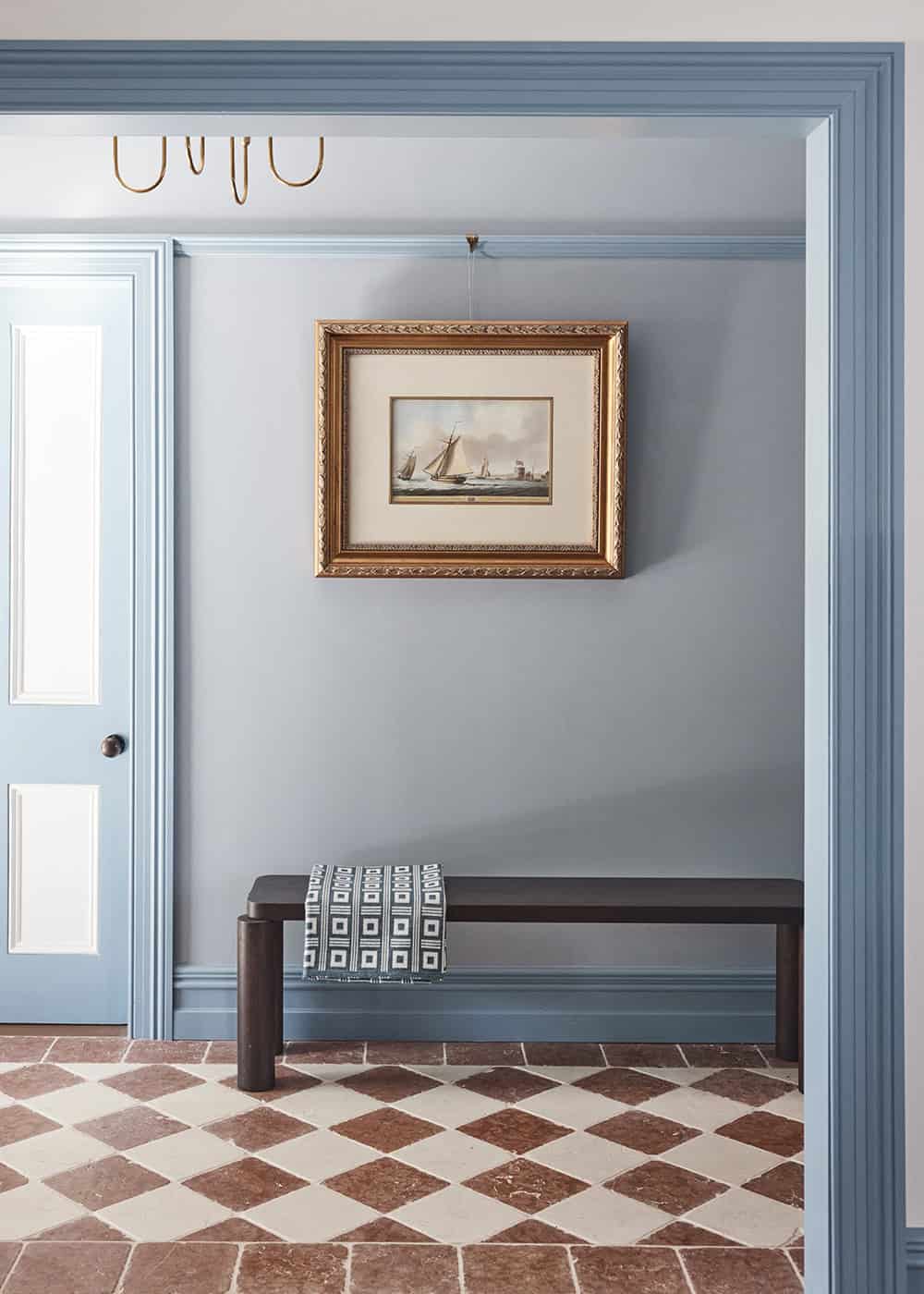
One of the most striking aspects of the home is the powerful use of colour, particularly the gorgeous cornflower blues, and deep navies that are balanced out with warm reds and crisp whites. It’s a bold yet beautiful palette that is homely, welcoming and one-of-a-kind.
“The blue was a way to create a sense of impact on arrival in the entrance hall and throughout the design process, it continued into the joinery and the trims in the more formal rooms. We liked the idea of a more neutral approach to the wall colour so that the clients could continue to add colour through their evolving collection of art and furnishings,” Jed reveals.
A Sense of Discovery
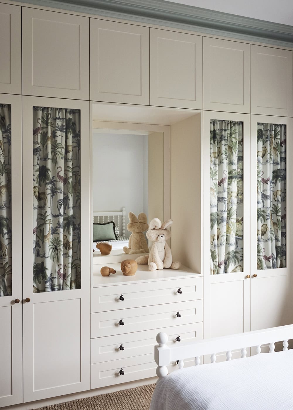
Another unique element is the use of wallpaper and patterned fabrics, which help add to the feeling of playfulness and fun of the property.
“We wanted there to be a sense of discovery in this house, as you turn a corner there is always something new to see. With the guest powder room, we aimed to create a ‘wow’ moment, which we achieved with walnut panelling to the bottom half of the wall and Cole & Son’s Geranium wallpaper to the top half,” Jed shares.
As for the bedrooms, the brief was to create an inviting place for the kids and a restful retreat for the parents.
“In the girls’ bedrooms, we used a pendant light that was made from rattan along with a wall light with petal-like detailing. In the joinery, we added animal-print fabric curtains and bunny rabbit handles, which can be updated as they grow older. A soft pale green carpet and striped blinds add some softness.”
“In the master bedroom, the colour palette is decidedly moodier, with dark blue carpeting and walls and Roman blinds of celadon linen. Rattan insets were added to the existing robes and the ensuite was updated to feel like a New York City Hotel,” Jed says.

Minimalist-Maximalist Zones
The team also played around with minimalist-maximalist zones, creating intentionally busy spaces like the living room with built-in shelves that have been styled with carefully curated ornaments and knick-knacks, which were balanced out with more pared-back areas.
“We wanted a mix of traditional and contemporary aesthetics and used this technique to balance out some of the visual impacts with areas of interest and also respite,” Jed notes.
In terms of the finishes, the Tom Mark Henry crew also riffed on the old world/new world juxtaposition the house so brilliantly bridges.
“The finishes have one foot in tradition while also feeling fresh and contemporary in their use of colour. For example, we used a beautiful Inge Holst plaid fabric from Elliott Clarke in a thoroughly contemporary teal and turmeric colourway in the hallway linen closet,” Jed explains.
Reflecting on the project, Jed is chuffed with the end result.
“We are proud that the heritage and integrity of the house have been retained and elevated, creating a uniquely personal family home that blends a traditional aesthetic with contemporary flair,” he says.

PROJECT CREDITS:
Project Team: Jed Murphy @jed__murphy, Madeleine Wood, Pia Watson
Interior Designer: Tom Mark Henry @tommarkhenry_
Photographer: Damian Bennett @damianbennettphoto Interior
Styling: Tristan Qasabian @tristten
Build: Rosato Projects @rosatoprojects
Words: Bella Brennan @bellarosebrennan
Loved our tour of Tom Mark Henry’s transformation of this Mosman home and want to keep perving some of the most stylish places going around? Take a tour of Byron Bay’s coolest new boutique hotel, Sun Ranch. Then, check out this gorgeous Bronte home which epitomises quiet luxury.
 Subscribe


 Subscribe
